head(dt)# A tibble: 6 × 3
Month X2021 X2022
<fct> <dbl> <dbl>
1 January 114171 194624
2 February 118548 223310
3 March 105853 224946
4 April 172499 206213
5 May 158913 246563
6 June 166119 244314Hi everyone,
Happy new year! I hope you had a relaxing holiday season and that 2023 is treating you well so far.
Well, here’s another treat for you: today we are going to make a dumbbell plot from scratch, using our dear old friend {ggplot2}. Something quick and easy to get going in 2023, but fun nonetheless - and hopefully, useful too. Let’s start by defining what a dumbbell plot actually is:
A dumbbell plot (also known as a dumbbell chart, or connected dot plot) is great for displaying changes between two points in time, two conditions, or differences between two groups.
Source: amcharts.com
You might have seen this before in one of the nice visualisations that the OECD publishes from time to time:
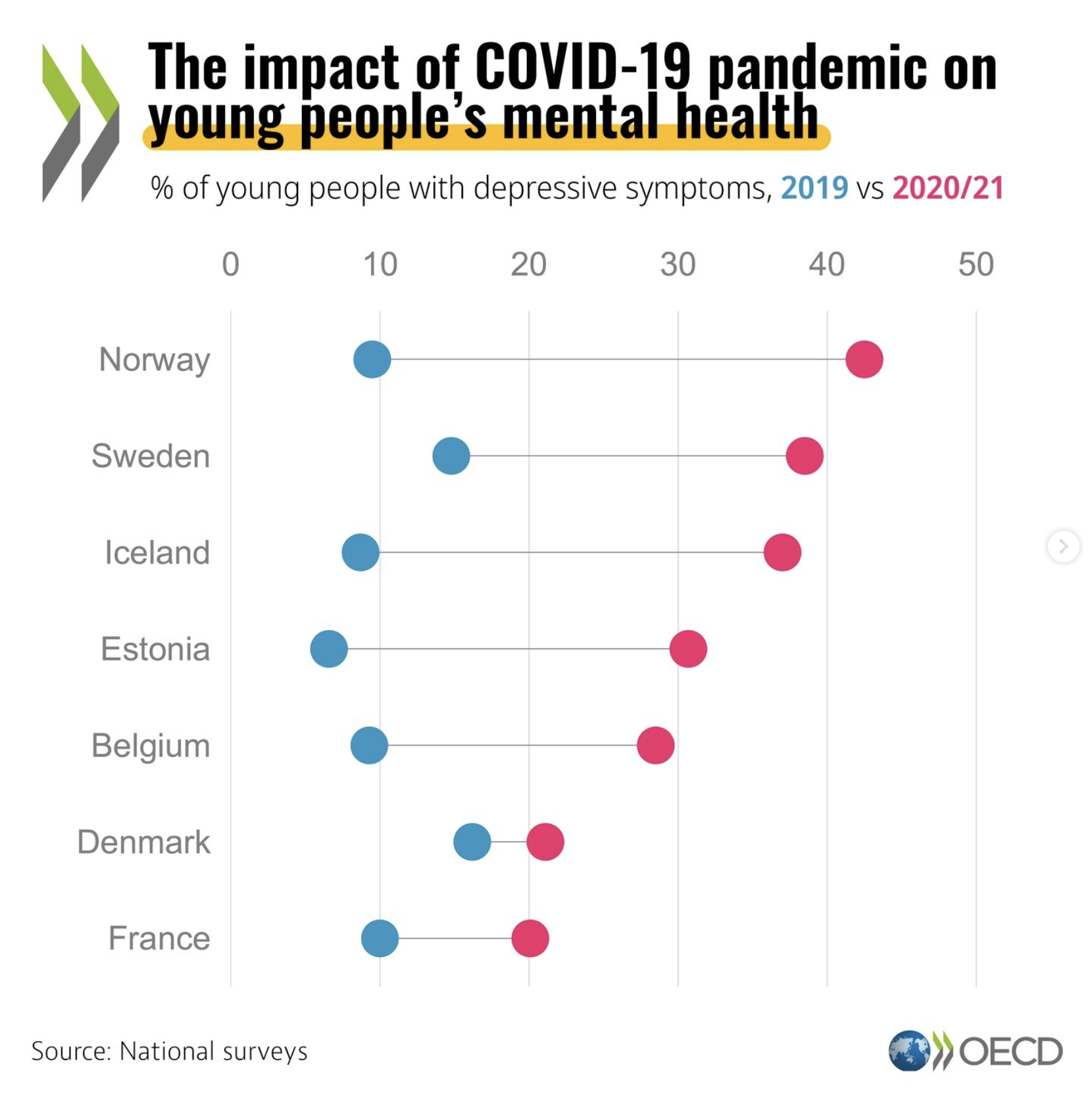
As you can see, this is an intuitive way of showing how a certain metric has changed between two points in time. Let’s get going then, shall we?
For this example, we will use data on monthly step counts that yours truly logged in 2021 and 2022. One of the things I wanted to do more of in 2022, compared to 2021, was walking; will I have succeeded with that? Well, we’ll find out soon.
I extracted this data from Garmin Connect, as I have been wearing a Garmin watch for the past few years now, and this is stored in a dataset named dt:
head(dt)# A tibble: 6 × 3
Month X2021 X2022
<fct> <dbl> <dbl>
1 January 114171 194624
2 February 118548 223310
3 March 105853 224946
4 April 172499 206213
5 May 158913 246563
6 June 166119 244314A very simple dataset, not much to see here. Let’s start building our plot: first, we create a ggplot object and put the different months on the vertical axis:
library(ggplot2)

db_plot <- ggplot(dt, aes(y = Month))
db_plot
Not much to see yet. Then, we add a set of points for 2021 data:
db_plot <- db_plot +
  geom_point(aes(x = X2021, color = "2021"))
db_plot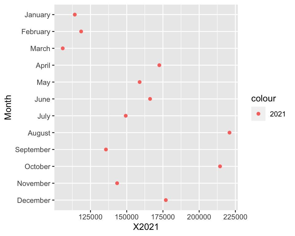
Same as before, but we add data for 2022:
db_plot <- db_plot +
  geom_point(aes(x = X2022, color = "2022"))
db_plot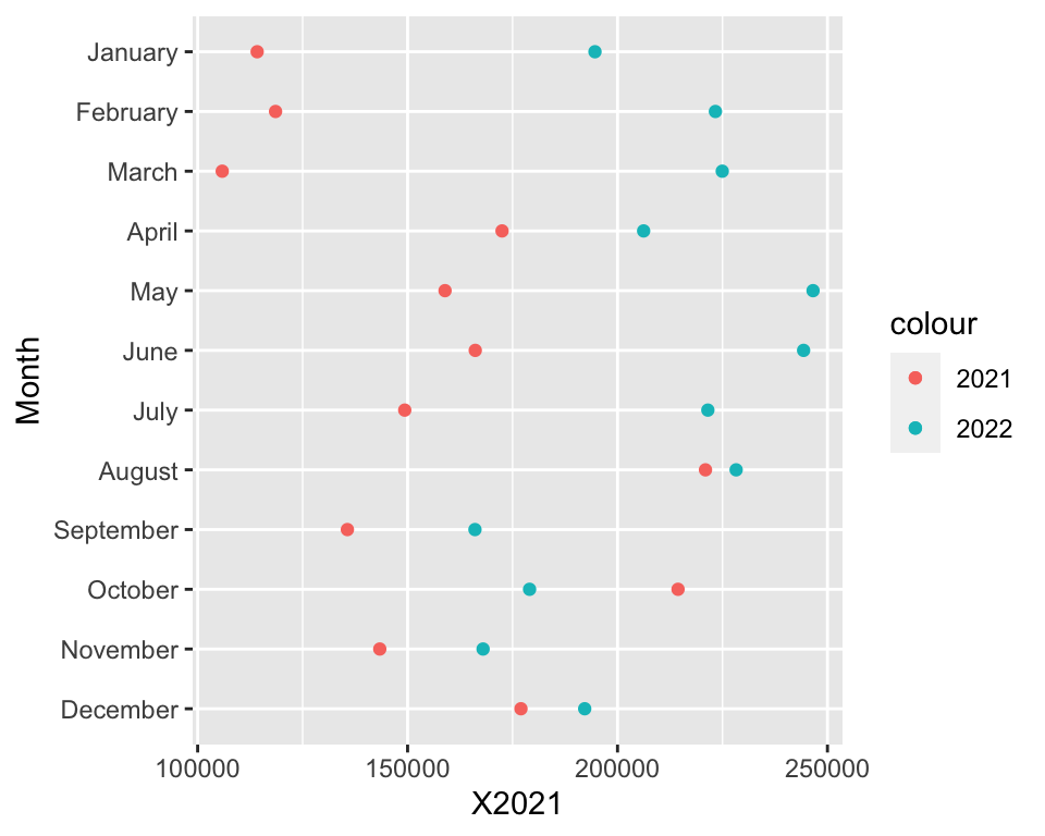
It’s coming together nicely, isn’t it? Now, we add a segment to join the two sets of points:
db_plot <- db_plot +
  geom_segment(aes(yend = Month, x = X2021, xend = X2022))
db_plot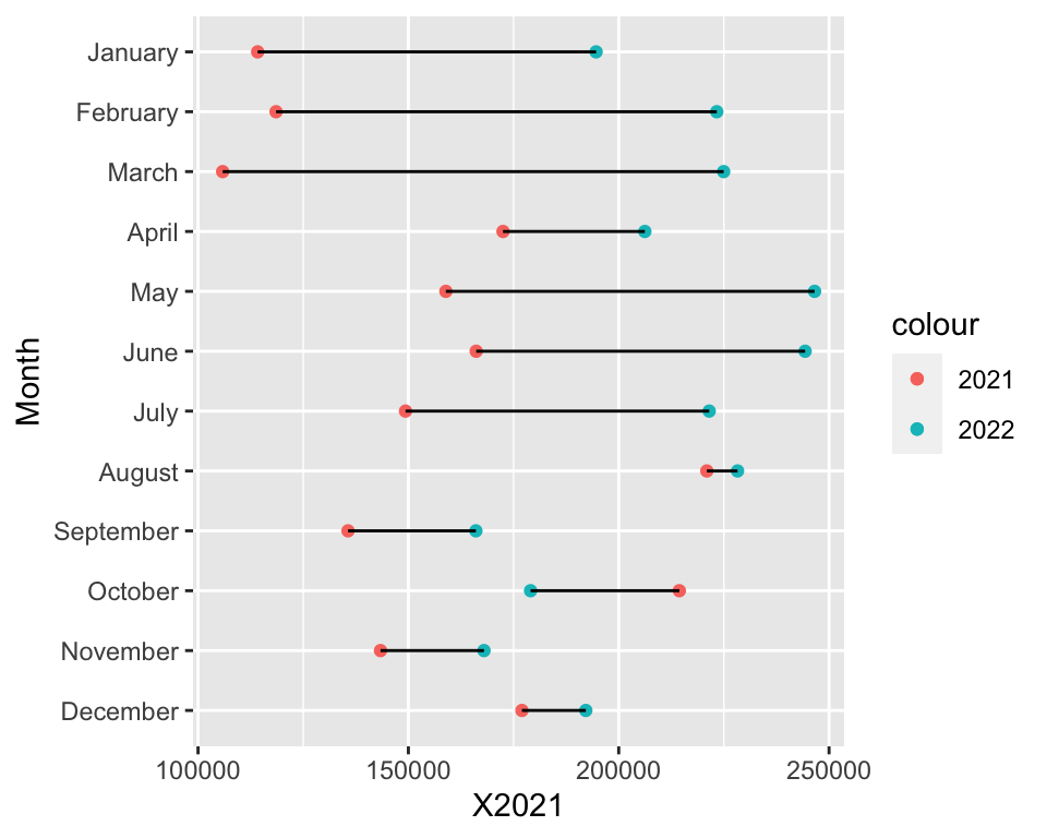
And there you have it. Thank you for reading and… wait! We are not done here, of course - now we need to turn this into a nice plot.
One problem here is that the segment overlaps the data points: that looks ugly. To solve this, we need to rebuild the plot but add the segment geometry first:
ggplot(dt, aes(y = Month)) +
  geom_segment(aes(yend = Month, x = X2021, xend = X2022)) +
  geom_point(aes(x = X2021, color = "2021")) +
  geom_point(aes(x = X2022, color = "2022"))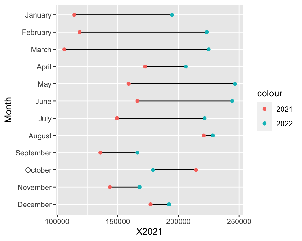
Already better! Then, let’s make the data points larger and change the colour of the bar to grey:
ggplot(dt, aes(y = Month)) +
  geom_segment(aes(yend = Month, x = X2021, xend = X2022), color = "grey50") +
  geom_point(aes(x = X2021, color = "2021"), size = 3) +
  geom_point(aes(x = X2022, color = "2022"), size = 3)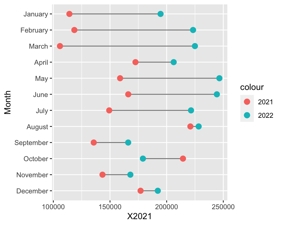
Let’s add a better scale for the horizontal axis; for this, we use the comma() function from the {scales} package:
library(scales)

ggplot(dt, aes(y = Month)) +
  geom_segment(aes(yend = Month, x = X2021, xend = X2022), color = "grey50") +
  geom_point(aes(x = X2021, color = "2021"), size = 3) +
  geom_point(aes(x = X2022, color = "2022"), size = 3) +
  scale_x_continuous(labels = comma)
Let’s label the plot correctly:
ggplot(dt, aes(y = Month)) +
  geom_segment(aes(yend = Month, x = X2021, xend = X2022), color = "grey50") +
  geom_point(aes(x = X2021, color = "2021"), size = 3) +
  geom_point(aes(x = X2022, color = "2022"), size = 3) +
  scale_x_continuous(labels = comma) +
  labs(x = "Steps", y = "", color = "Year")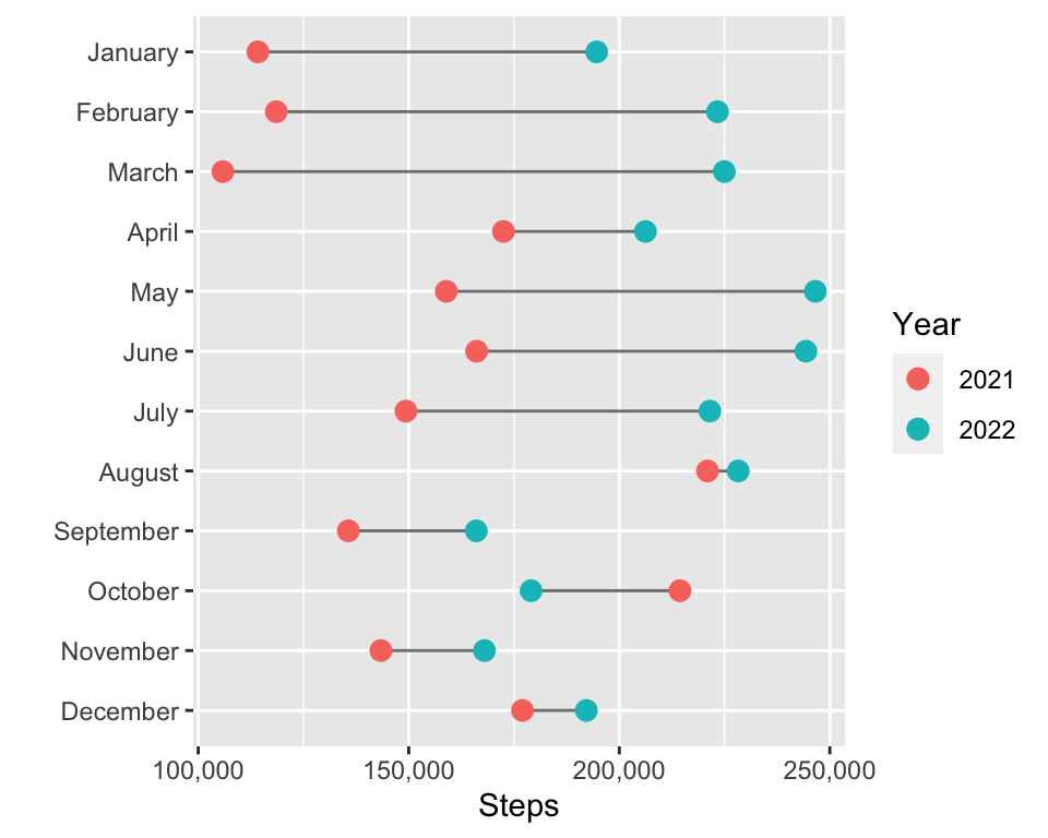
Now, the final touches: let’s change the theme of the plot and tidy things up a little:
ggplot(dt, aes(y = Month)) +
  geom_segment(aes(yend = Month, x = X2021, xend = X2022), color = "grey50") +
  geom_point(aes(x = X2021, color = "2021"), size = 3) +
  geom_point(aes(x = X2022, color = "2022"), size = 3) +
  scale_x_continuous(labels = comma) +
  theme_bw(base_size = 12) +
  theme(legend.position = "bottom", plot.margin = unit(x = rep(1, 4), units = "lines")) +
  labs(x = "Steps", y = "", color = "Year", title = "Monthly Steps Walked, 2022 vs 2021")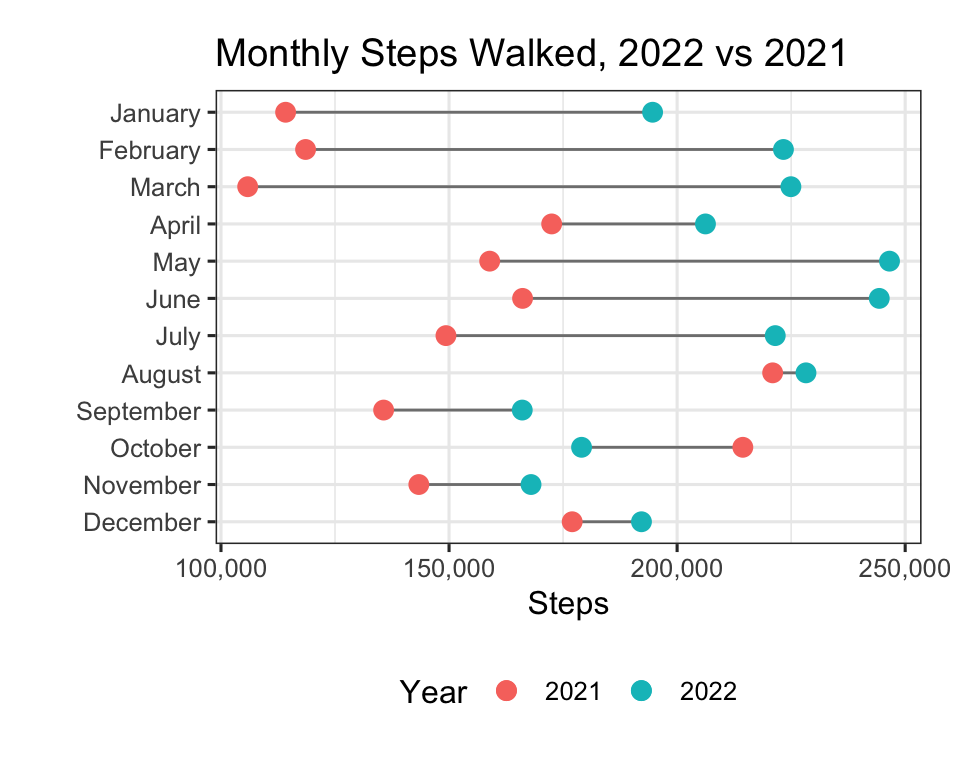
We can also simplify the above by turning our data into long format:
library(tidyr)

dt_long <- pivot_longer(data = dt, cols = starts_with("X"))
dt_long$name <- factor(dt_long$name, levels = c("X2021", "X2022"), labels = c("2021", "2022"))
head(dt_long)
# A tibble: 6 × 3
Month name value
<fct> <fct> <dbl>
1 January 2021 114171
2 January 2022 194624
3 February 2021 118548
4 February 2022 223310
5 March 2021 105853
6 March 2022 224946The required code is very similar to what was used above, but we can now easily modify the colour palette too, and improve the title using {ggtext}:
library(ggtext)

ggplot(dt, aes(y = Month)) +
  geom_segment(aes(yend = Month, x = X2021, xend = X2022), color = "grey50") +
  geom_point(data = dt_long, aes(x = value, color = name), size = 3) +
  scale_x_continuous(labels = comma) +
  scale_color_manual(values = c("#F5DF4D", "#6667AB")) +
  theme_bw(base_size = 12) +
  theme(
    legend.position = "none",
    plot.title = element_markdown(),
    plot.margin = unit(x = rep(1, 4), units = "lines")
  ) +
  labs(
    x = "Steps",
    y = "",
    color = "Year",
    title = "Monthly Steps Walked,
    <span style='color:#6667AB;'>2022</span>
    vs
    <span style='color:#F5DF4D;'>2021</span>"
  )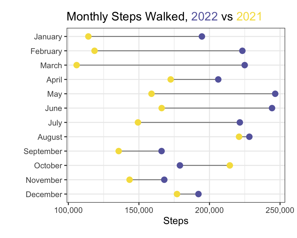
And yes, for all you colours nerds out there: the two hex codes are Pantone’s colours of the year for 2021 and 2022, “Illuminating” and “Very Peri”. Fitting, right?
And yes, I did walk more in 2022 compared to 2021, it turns out! Well, except for October, but to be fair, I did run 120 km that month in 2021 compared to a shameful 0 km in 2022, so it could have been worse…
So there you have it: a short tutorial on building a dumbbell plot from scratch using {ggplot2} and other freely available tools, and making it nice (subjectively, of course). Other options for making dumbbell plots in R do exist, of course, such as the {ggalt} package - make sure you check that out too. And until next time, take care!