Introducing the new {KMunicate} package, now on CRAN, which can be used to create Kaplan-Meier plots that follow the style recommended by the KMunicate study.
Published
August 7, 2020
A few weeks ago, Tim Morris launched a competition on Twitter challenging his followers to write some code to create KMunicate-style Kaplan-Meier plots. I (obviously) took on the challenge, and I must admit: I got slightly carried away… hence now introducing the {KMunicate} R package.
{KMunicate} is now on CRAN, and the development version lives on my GitHub profile. You can install the CRAN version as usual:
install.packages("KMunicate")
Alternatively, you can install the dev version of {KMunicate} from GitHub with:
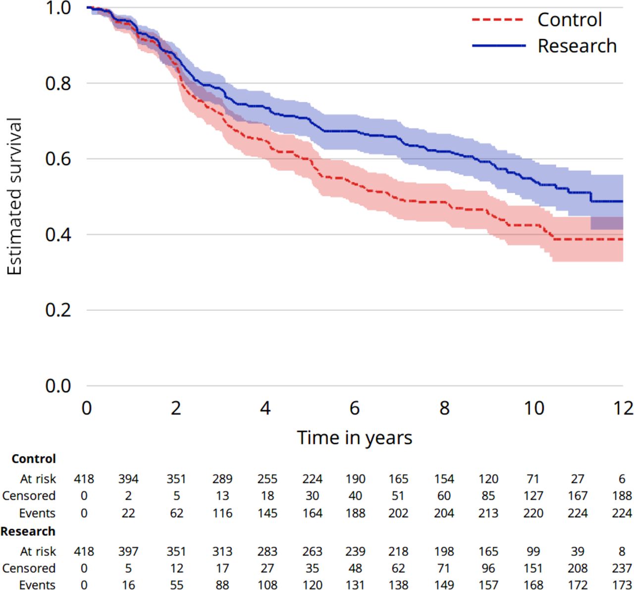
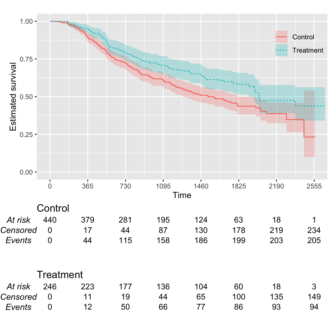
KMunicate-style Kaplan-Meier plots include confidence intervals for each fitted curve and an extended table beneath the main plot including the number of individuals at risk at each time and the cumulative number of events and censoring events. Here’s an example from the KMunicate study itself:
As you might imagine, that’s quite a lot of work to produce a plot like that.
Well, not anymore!
The {KMunicate} package lets you create such a plot with a single line of code. Isn’t that great?
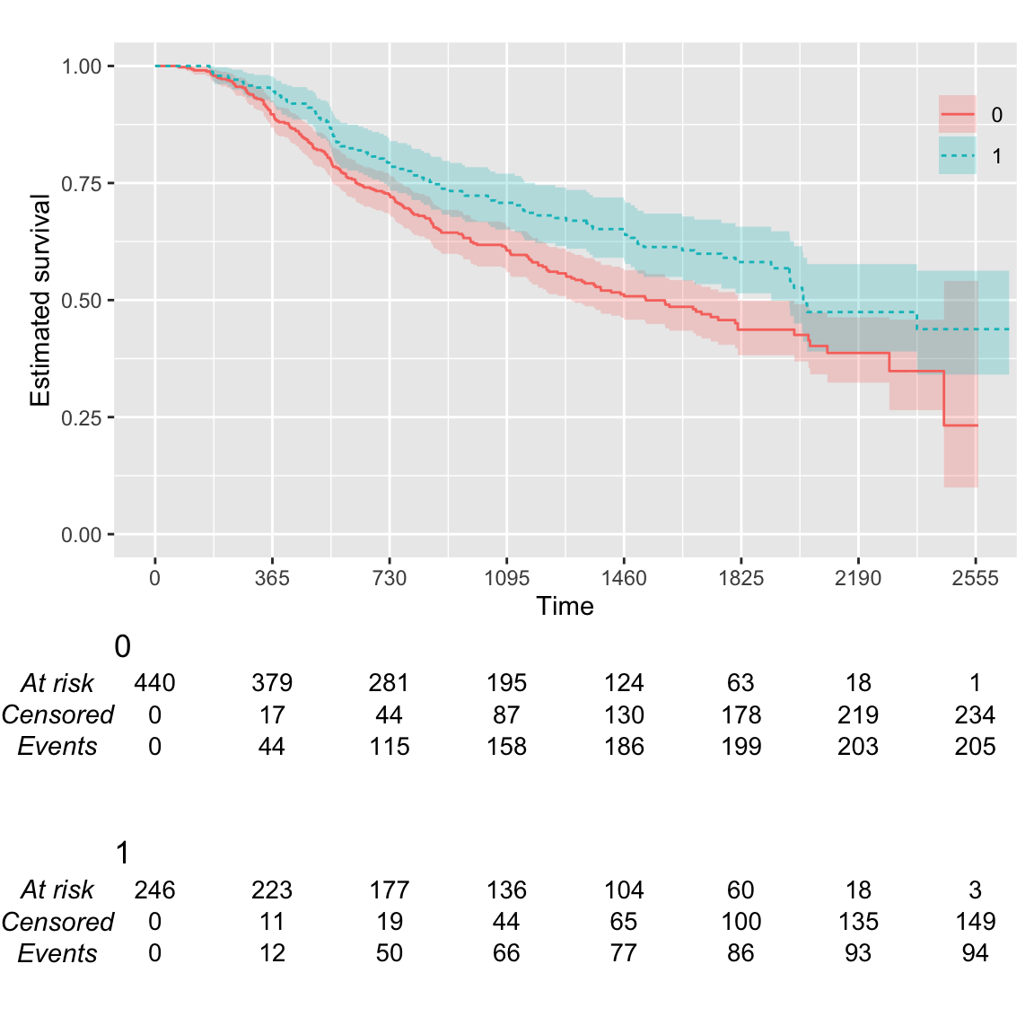
Let’s illustrate the basic functionality of {KMunicate} with an example. We’ll be using once again data from the German breast cancer study, which is conveniently bundled with {KMunicate}:
The survival time is in rectime, and the event indicator variable is censrec; the treatment variable is hormon, a binary covariate.
First, we fit the survival curve by treatment arm using the Kaplan-Meier estimator:
library(survival)fit <-survfit(Surv(rectime, censrec) ~ hormon, data = brcancer)fit
Call: survfit(formula = Surv(rectime, censrec) ~ hormon, data = brcancer)

           n events median 0.95LCL 0.95UCL
hormon=0 440    205   1528    1296    1814
hormon=1 246     94   2018    1918      NA
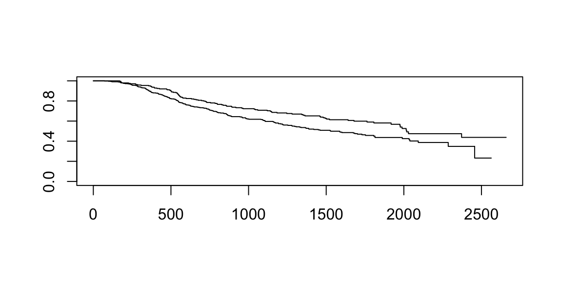
The plot that can be obtained via the plot method is ok but needs a bit of work to be good enough for a publication. For instance, this is the default:
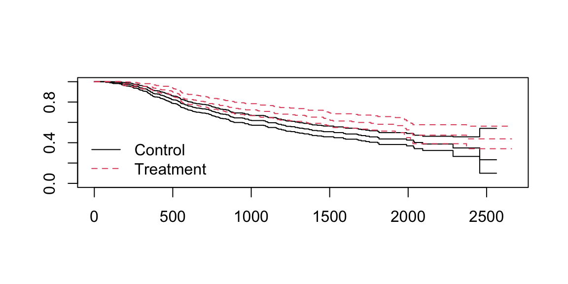
This is better, but still not great: the area defined by the confidence intervals is not shaded, and there is still no risk table.
Here’s when the {KMunicate} package comes to the rescue. First, we need to define the breaks for the x-axis; the risk table with be computed at those breaks. Say we want breaks every year:
time_breaks <-seq(0, max(brcancer$rectime), by =365)time_breaks
When overriding the default theme, we need to re-define the font for the main plot using the base_family argument of a theme_* component. Overall, I think this is a much better plot!
Exporting plots
The final step consists of exporting a plot for later use, e.g. in manuscripts or presentations. That’s straightforward, being the output of KMunicate() a ggplot2-type object: all we have to do is use the ggplot2::ggsave function, e.g. in the next block of code.
Further details on {KMunicate} can be found on its website, with more examples and a better explanation of the different arguments and customisation options. Let me know if you find the package useful, and if you find any bug (I’m sure there’ll be some) please file an issue on GitHub.
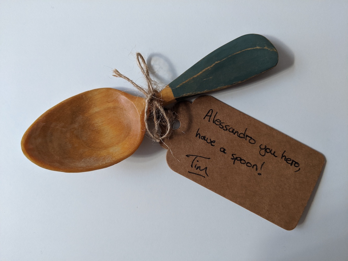
And what about Tim’s challenge that led to the inception of {KMunicate}, you might ask? Well, I got myself a beautiful hand-crafted wooden spoon: