Oops! …I did it again
Hey!
Notice anything different around here? Yes, your eyes are not failing you… we have a new shiny theme!
I wrote a little bit about the design of the original theme when introducing the blog, but after a little while, I wasn’t really happy with it. I mean, it was quite nice (I think) and performed decently, but I really, really wanted to build something from scratch. Let’s call it my own kind of social distancing…
That’s why a few weeks ago I started refactoring the website: I branched out and started building a new Hugo theme from scratch. The design is really similar to the previous one, with the largest difference being the typography: I wanted to reduce the overhead that comes with importing web fonts, so I went for a system font stack. This will not look the same everywhere, but it will be faster and (most importantly) it will feel native on every device.
I also decided to use Bulma.io to build the website: that was loads of fun (🙃), and I think I can finally say that I get CSS frameworks. It’s still a quite heavy dependency (as Bootstrap was), but there are options to stip it down to the bare essentials to increase performance; I started having a look into it, and I might end up fiddling more around that idea…
So, what’s changed around here?
In practice, not much: the navbar is now a proper navbar, and (as I mentioned before) I abandoned my beloved Noto Serif (I’ll find a good use for you, one day!).
The colours have also been slightly tweaked, as I have been reading a bit more about the science of colour contrast and good practices in web design. Unsurprisingly, colour science is a whole lot of science… but nevertheless, the whole website should feel similar. No drastic changes here.
On the top left corner (and in the tab bar on your browser) you’ll notice we have a new logo/favicon! The icon is made by Vectors Market from www.flaticon.com, and I customised it to match the theme of the website. Moreover, it should now look better on mobile devices.
I am also now using Hugo’s default syntax highlighting engine Chroma instead of the highlight.js library; Chroma is server-side and blazing fast, and we don’t have to import unnecessary JavaScript anymore. Yeah, most JavaScript is now gone, so performance should be even better. This also allowed me to set up a different highlighting style for light and dark mode: GitHub and Dracula, respectively. This should match the overall style of the website a bit better. The big downside of Chroma is that it doesn’t support Stata syntax highlighting (yet), but I guess I can live with that.
I also took the opportunity to start implementing a new section of the website collecting a list of talks I have given in the past few years, ever since I started my PhD basically. The whole thing is built on-the-go using Hugo’s templates and a specific content type, which was quite cool (and fun) to implement. It is not online yet, as I have to figure out some issues with Netlify/Hugo messing up HTML slides… but it’s coming soon™!
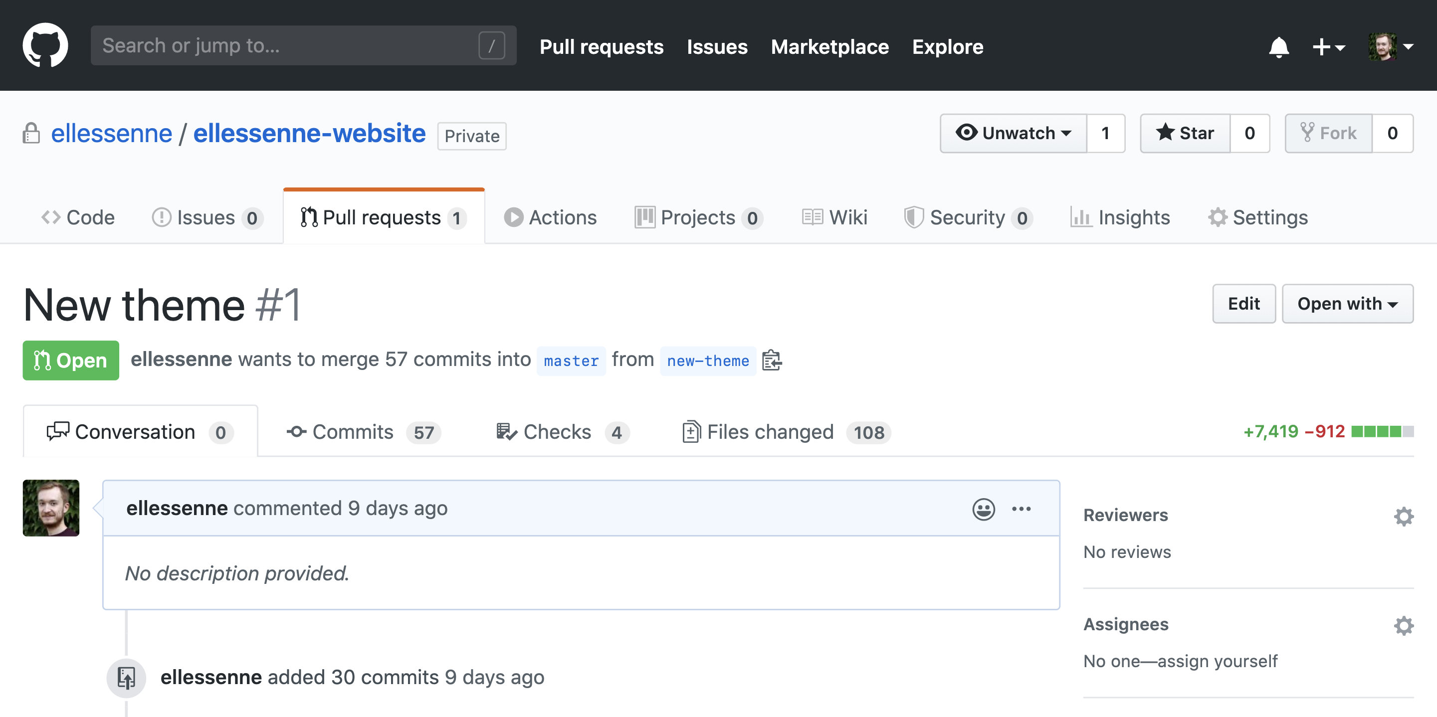
This is pretty much it… not a lot has changed on the front, but under the hood, well, I let you be the judge:

I would call that a decent amount of changes if you ask me.
As always, let me know if you spot something that looks odd and take care!