Introducing ellessenne.xyz
Here we are. I finally am.
I web, therefore I am.
I finally got around to build my own personal website using Hugo and blogdown. And it only took several months of playing around with Hugo, learning how templates work, and fiddling around with HTML and CSS.
To be fair, I could have had a website up and running in minutes, literally. For instance, the Alternative Abstracts website was set up and deployed on Netlify in just a few minutes after an interesting discussion over dinner. Alternative Abstracts hasn’t gone anywhere (yet?), but the point is: the whole process was effortless.
I could have picked one of the hundreds of themes ready to use and available online, but what’s the fun in that? Of course I had to have a theme that felt mine.
But why?
– Literally anyone else
Well, you don’t want your website to look like any other website, right? Right?

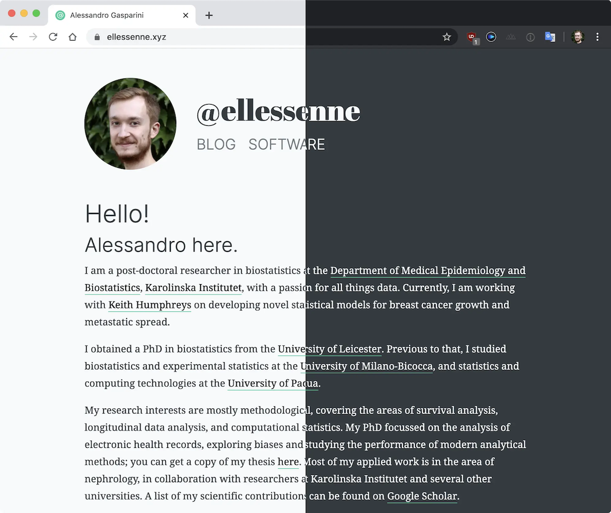
Oh well… anyway. Do you want to see something nice? Try switching on dark mode on your device (or turn it off for a moment if you are a dark mode everything kind of person):

The website uses the prefers-color-scheme CSS media feature to detect if your device is using a light or dark colour theme, and consequently adapts the CSS to use the appropriate colours. Cool right?
I spent a lot of time thinking about typography and colours as well, and I almost ended up sticking with Bootstrap’s default font stack. I mean, it’s nice and it’s a native font stack meant to optimise text rendering and look native on every device and OS (see here), but once again: what’s the fun in that?
I ended up choosing a combination of fonts:
Inter for UI components and headers. Inter is a project I have been following for years now, and I think it fits well in modern designs;
Noto Serif for text. Noto is Google’s answer to tofu. Confused?
Fira Code for code listings. I mean, look at these gorgeous ligatures:
beautiful <- TRUE
beautiful == TRUE
beautiful <= more_beautiful- Abril Fatface for the website header. No special reason here, it just looks cool!
It took me a looooong time to settle on these specific fonts (as you would expect), but I think it looks great now. And emojis are supported too: :pizza: = :yellow_heart:
The overall colour scheme is somewhat flat and simple, with grey hues and #20C997 (oddly named strong cyan or lime green) as an accent colour. Let me know if something looks weird on your device, feedback is always welcome. And speaking of feedback: the easiest way to get in touch is by e-mail or on Twitter.
Finally, the most important question still stands:
Pal, what is this all about?
– Probably you while reading this
I don’t know, really. I am looking forward to putting down thoughts on statistics, data, and research in general, plus whatever I will find interesting and worth sharing. All I can promise you is that there will be (lots of) code snippets in R.
Anyway, this is it for now. Let’s see how this goes, and I’ll be back soon!